|
This is the place to view
(and laugh at) all the stuff I've "produced" graphically (all
the stuff I've managed to scan in and post so far, that is). Much of the
stuff on here will require you to allow pop-ups in order to see larger
versions of the images, FYI.

When I recently moved into my new
bachelor pad, I had the occasion to revisit all the crap that had piled
up for years, something of an archaeological expedition, and stumbled on
a bunch of old stuff that had been buried in various strata. Among these
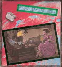
is a comic I drew when an undergrad at Humboldt State University, in the
sadly defunct "Cluster" program. Ah, those were
<any number of expletives here> days. Here's proof I was
there:
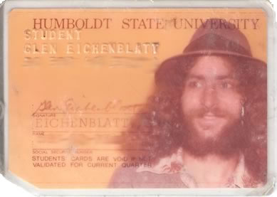
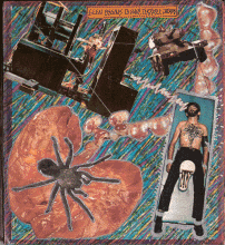
Hey, I spent a lot of time cultivating that look! Anyway, Cluster was a way cool progressive
program that got its students through all the General-Ed requirements
via an interdisciplinary curriculum based on a single unifying concept
each semester. The center of this program was "Colloquium"
— a central
gathering in a big ol' classroom in the "real" part of the school (the
rest of the program operated out of two funky old houses on campus),
where the main lectures and presentations for the whole group were held.
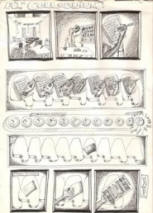
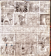
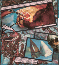
The lectures were sometimes
something less than stimulating, hence
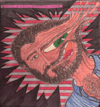
». In case it isn't abundantly
clear, those white "4"-like shapes are supposed to be the goofy fold-up
desktops so commonly found on bolted-to-the-floor torture chairs in old
(and new? - it's certainly been quite a while since I've been in one) classrooms. The fuzziness in the
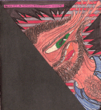
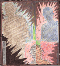
foreground of the first frame is meant to be (and it actually looks a hellova lot like) the backs of the heads of me and Carrie,
my then partner in crime. Another example of what I was doing instead of
listening in Colloquium can be found by clicking
. Part of the
Cluster program involved student-led classes. I decided to utilize my
knowledge and love of underground comix to lead a class in that
subject. Using the amazing text, appropriately entitled, "A History of
Underground Comics", we studied... well, surely you can guess what. The final
project for that class was
, a comic book filled with comics written, conceived and drawn by
members of the class. The comic strip linked above appeared in Kluster
Komix, as did many others from other students in the class, and the link
to the comic book, above, shows the cover, drawn by yours truly. When
viewing, please remember to cut me some slack - we're talking about
these things coming to life in the late 70s, after all.
Nelgraphix was the
name of my erstwhile "company" in Arcata California, which functioned,
failingly, as an endeavor to eek out a living with a pen during lean
times.
Here are some items related to that endeavor: "
"
is an ad/poster for Nelgraphix -- it was plastered all over Arcata for a
while; and the masthead for the
, for which I had the pleasure of being art director of for a couple of issues
(I got canned for inserting a "writing"
I had authored just before it went to press and without anyone
"approving"
its insertion. That writing inspired some controversy beyond the editors
of the Irregular -- apparently it didn't go down well with some of the
more conservative members of the community the paper serves...
I also did
the logos for two new record stores that stormed into Arcata to give my
old boss at TRS (see below) a run for his money.
was a
pretty good store.
was (and as far as I know, still is) a
damned fine used and new record store with a great selection, and a very
very knowledgeable owner/operator. In addition to the People's logo, I also
designed signage and an Open/Closed sign that lived in the store for
many years (but was gone last few times I was back up there).
See the "Mojos Posters" section, below for more
Nelgraphix endeavors.
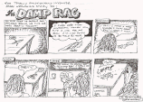
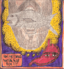
Also, during this period was the ever-turbulent relationship with the
lovely Carrie Sue, for whom I hastily drew, one afternoon, the classic
mini-strip that summarized my perspective on our relationship at that
moment. It is entitled,
"
."
(Hi-Res version)
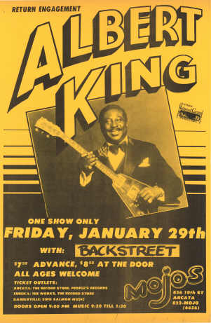
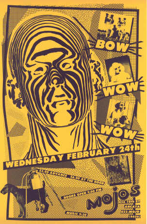
Though I
never did get paid for any of them (naive as I was in those days, and
ever-so-trusting — the bastards that owned
the place kept making promise after promise, and I, like a schmuck, kept
believing and believing them), I did make a few dozen heavily
distributed posters that were displayed on telephone poles, in stores,
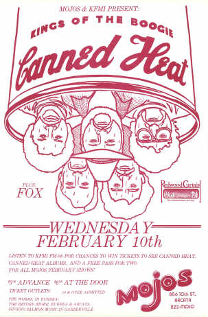
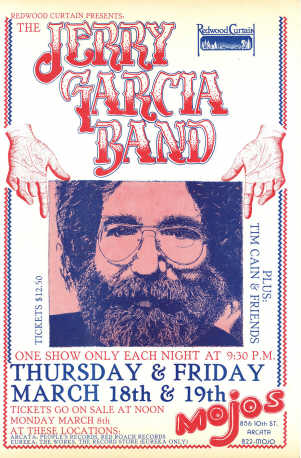
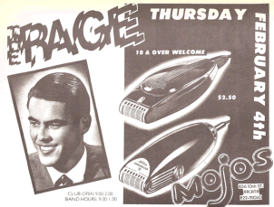
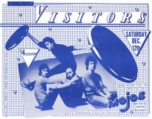
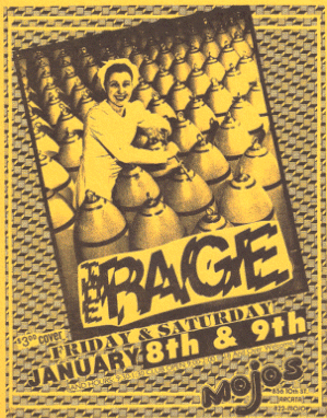
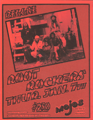
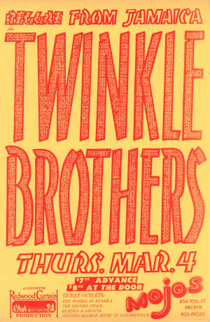
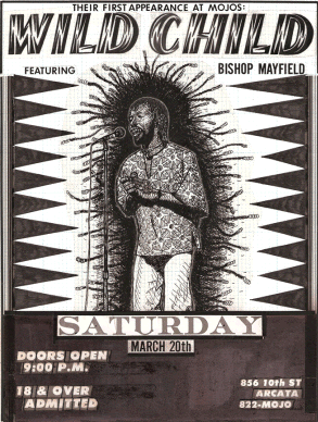
etc., all over Humboldt County. Mojos was a pretty cool club — THE club
in Humboldt at that time — residing in what I
vaguely remember to have been an old converted bowling alley
— there
was a restaurant, a performance space and a dance-floor. As I recall,
the food was pretty good, and I may have even finagled a free meal or
two in lieu of payment.
The posters
were a fun project. I had a slew of really old Life, Look and Saturday
Evening Post magazines that had the most wonderful retro imagery in them
(at a time when Retro was at a high point, at least on the northcoast),
so I cut those up and stole images from them, and added my own artwork and lettering, as you
shall see, below. The Wild Child poster shown below, by the way, is
scanned from the original artwork — the transfers made all the dark
areas dead black in print (a little layout artist's trick), and the
Mojos logo has obviously been lost.
All of this,
incidentally, was WAY
before computers, and so was done entirely by hand. Elements
were collaged onto a paste-up board using wax (an ancient layout method - it acted
like glue, but allowed you to easily pull an element up and reposition
it), and I sure made a lot of use of Letraset letter and pattern sheets
and tape! In those days, you used a special roller/pen-thingie on the
backside of the lettering sheet, and the pressure caused the letters to
transfer to the paper you're rubbing them onto. You had to line
everything up by eye, and when you run out of e's (for example), you
gotta go buy yourself another sheet!
Most of the
posters were in 11x17 format. They were nothing, if not eye-catching, if
I do say so myself.
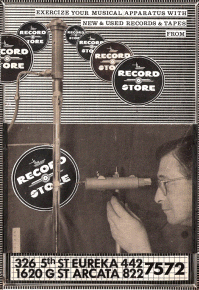
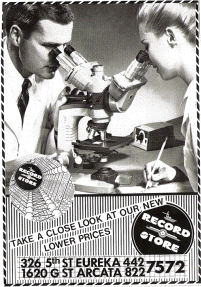
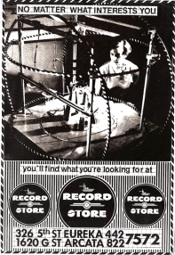
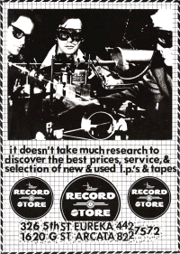
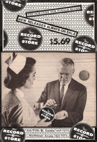
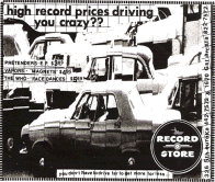
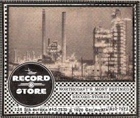
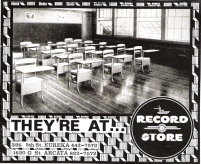
The Record Store
—
Displays, Ads & More
During this
same period, I became the manager of one of the two record stores in
Eureka, CA. Here's a brilliant marketing scheme: hold a contest to see
who can come up with the best name for the store. Give away fabulous
prizes ("fabulous" is a relative term in Redwood Country). This
is precisely what the owner did. Thousands of entries later, with pomp
and circumstance, the great winning entry was revealed. So, I'm not
really sure what this says about the quality of the entries, or the
intelligence of the owner, but, incredibly, the winning name was:
...drum roll please... "The Record Store." I shit you not.
of
the storefront's main display window with "the Costume." Henceforth, I shall refer to the place as "TRS."
So, I became
the manager of TRS Eureka (there was another store in Arcata), and was given more or less free reign to do what I would
with advertising (print [see below] and
radio),
,
,
and
so on. This was the late 70s, when the New Wave movement in music was in
full swing, and us artsy-types sequestered deep behind the redwood
curtain latched onto that thing with gusto. My store became "the spot"
for every wild-natured person on the northcoast to come and listen to
and purchase the music of the moment. Using Licorice Pizza as my model
(I think I talk about the Licorice Pizza days on here somewhere),
my store had a very comfy couch, and was a cozy place to sit and chat
and listen to music.
As a
side-note, and just because I want to tell it, here's a little tale of
what life in those days was like: there was a back-room/studio upstairs
in the back, where I made a loft and more or less lived for a while. I
took my baths at the Eureka Hot Tubs a couple of blocks away in Old
Town. I don't remember where I took my meals, but I assume I ate. My
upstairs studio was where I painted, animated, listened to music, and
danced flailingly whenever I had the opportunity. After living with lots
of hippies for a long time, I ate the solitude up like a hungry
wildebeest.
I also used
the studio space for constructing work-related displays and signage. I
had learned to do lettering at Licorice Pizza, and had developed a style
of my own, which I employed for all the signs at TRS. I created some
award-winning displays, including one for the B-52s (
 for the cover teaser for the Brown Spot newsletter from our distributor,
or
for
the article about it), and
which featured what
looked like a very strange woman sitting in a hot-pink chair, except
that her torso (sans head) rotated (it was mounted on a turntable). I
had a lot
of fun. for the cover teaser for the Brown Spot newsletter from our distributor,
or
for
the article about it), and
which featured what
looked like a very strange woman sitting in a hot-pink chair, except
that her torso (sans head) rotated (it was mounted on a turntable). I
had a lot
of fun.
What was also
a whole lot of fun was designing our advertising campaigns. There was a print campaign and a radio campaign. I got to design, write, record
and place all ads. One of these days, I'll find the tape of the radio
spots and digitize some for posterity on here...
So, here are
some examples of the newspaper ads:
|
|
|
|
|
|
Click 'em
for
LARGER
versions |
|
|
|
|
|
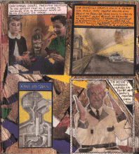
Stuff for Harv
Some while
ago, my old pal Harvey
re-delivered into my possession a series of letters I had written him
over the years, including some vaguely artistic items I will hereby
chronicle.
Within a
particularly dense package of materials, came an interesting, but more
or less incomprehensible item
consisting of a three page "story" —
each page consists of three clear
acetates sandwiched together, which, theoretically, should be "readable"
independently. Here are the instructions that were attached to the
manila envelope the thing
came in (click image for jumbo version):
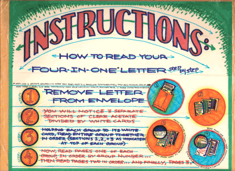
Great
concept, weak material. If better thought out, and actually readable, it
might be quite interesting, but... Oh well. It was fun.
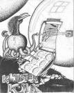
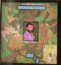
Found in
there, with frames scattered across three acetates, is this little comic
strip I like to call, "The Story of Life." I think it speaks for itself:
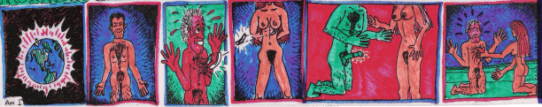
Also found
among these artifacts, which represent a regrettably lost period in
which I actually invested a lot of effort into communicating with my
friends, were "cells" from a couple of goofy little animation
loops I made:
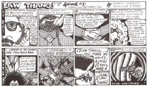
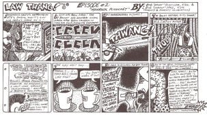
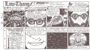
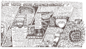
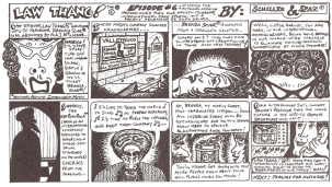
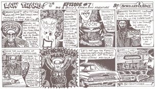
And then there were
the legendary "LawThang™ Comix" - a mid- to late-80s labor of
love and collaboration with the severely ingenious and deeply
disturbed mind of my former colleague and good buddy,
Rich Neimand (his body
apparently having had nothing to do with it).
had decided
that Jacoby & Meyers's internal newsletter (cleverly mastheaded
the "Consultation"), of which he was editor & designer, needed
something to spice it up and decided that a comic strip would
be just the ticket. We put our peculiar minds together
and dreamt up the concept of LawThang™, mild mannered family law
attorney and model citizen by day, punk rock legend-in-his-own-time
and foiler of international conspiracies by night. The
strip grew increasingly bizarre by the episode and was met with
general incredulity by the Consultation's readership. To their
credit, the partners (Len Jacoby, Steve Meyers [may he rest in
peace], and Gail Koff [may she rest in peace]) were incredibly good sports, giving Rich
and I complete free reign to put out a strip that had almost nothing whatsoever to do (beyond the occasional in-joke and
reflections of the J&M logo here and there) with the firm. More
likely, they never bothered to read it, otherwise, LawThang™
would undoubtedly have become history before it actually did
become history.
The Plot (which,
though obliquely contorted, somehow managed to thicken) had
something to do
variously with practicing family law, being a punk rock idol
(Bob is lead singer/songwriter for "LawThang™ and the Habeas
Corpuscles"),
getting mixed up in a "nouvelle cuisine terrorist" plot, getting
targeted as a bad influence on children everywhere by MAIM
(Mothers Against Intelligent Music, headed up by Tipper Spore),
who in turn was associated with the nefarious Ayatola of
CocoCola (otherwise know as the "AyaColaSM," whose jihad
goal was the imposition upon the world of a single soft-drink
standard), an exploding Kiwi-Fruit Frappe, the focus of media attention
on our hero Bob as generated by WPU-TV Reporter Brenda Scar (who
instantly becomes LawThang™'s love
interest), a legendary benefit rock concert called "Alimony
International," and Bob's enlistment of the assistance of a Superb Court Justice whose semi-secret super-identity
moniker is
"Wrenchkissed Man."
Along the way, the
erstwhile Bob Thang finds himself managing his practice,
directing commercials for his law firm,
performing at rock festivals, falling in love, and selling ThangThings™, all while fighting a very odd
international conspiracy involving a loosely-knit consortium
of wives of then senators, "Pastafarians," MAIM Hit-Mothers
and the Ayacola® himself. Oy Vey!
The strip was interrupted twice: once
because of my
(first)
, and once to make way for the spectacular "
" (the
Shamelessly Capitalistic Holiday) Edition, which features Bob
and his trusty secretary, Morgana De Tiempo selling everything
from Briefcase Cookie Cutters to 100% Combed Polyester "Legal
Briefs™."
The Strips:
Sadly, we shall never
learn whether or not Bob Thang & Billy Wrenchkissed manage to
rescue Brenda Scar and save the world from maniacal
non-monounsaturated belief systems. Will LawThang™ emerge triumphant against
his hideous
and insidious foes? Unfortunately, we cannot say "tune in next
time for the continuing adventures of..." — because circumstances beyond our control led to
the untimely demise of the strip. Doubtless, this was due to an
or various annoyingly non-adolescent circumstance(s), such as
actually having to do some work, or getting "let go," or
having to finish grad school, or whatever. That's life, eh?
This
series is from Anal & Nasal
Retentive Ramblings, a notebook filled with grid-paper I created for
the love of Carrie Sue, during my first years in New York City (early
80s). It's a more or less sequential tale of
the various city tribulations I was enduring during the
NYC Angst period.
I'm slowly (but
surely) going through and scanning all this old crap
I found — there is so much more along
these lines, but, as I say, I'll add them as I can. |
|